
by Marvin Kane | Jan 28, 2018 | Business, Design, SEO
 The 1970’s Polyester Leisure Suit
Just like clothes, hairstyles and cars, web design trends go in and out of style. If you saw someone wearing a 1970’s vintage polyester leisure suit you would make a judgement wouldn’t you? If your homepage is the online version of that suit, be assured that visitors are wondering if you’re out of touch or you just don’t care.
 Thin Content
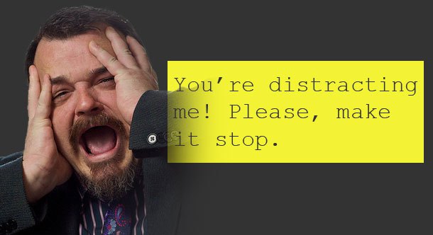
There’s just not enough useful information on your homepage. You might have lovely images, bells and whistles or any number of visual distractions. How does that help your visitors understand what you do, how you do it and why you’re different than your competitors?
 Contact Information Not Prominent
Isn’t The goal to get visitors to call or email you? It should be. Make sure your contact information isn’t buried somewhere or worse, not even present on your homepage. Don’t shoot yourself in the foot by giving your visitors what they want then making them hunt for your phone number.
 The Lovely but Useless Image Slider
You’ve seen them. They’re everywhere – those full width sliders that entertain your visitors by displaying rotating images with bits of copy superimposed on them. Yes, they are engaging but beyond being fun to watch what value are they really providing? Unless you’re a photographer or an artist where the image is the message, you’re not doing your visitors any favors by hogging the most valuable piece of real estate on your homepage with that image slider. There are other ways to make your homepage visually appealing without wasting prime space that should be used to tell your visitors who you are, what you do, why you’re different/better than your competition – you’re USP (unique selling proposition) – where you do what you do, what areas you serve and how to get in touch with you.
 The Disappearing Call-to-Action
We know about the call-to-action elements – you know those cool buttons that ask your visitor to click to download a pdf or sign up for your newsletter or make an appointment. Well it matters where those call-to-action elements are on your homepage. Make sure they are at least above the fold. If the page has lots of content, then put another one in the middle of the page. If the page is really long then put another one at the bottom. The point is that no matter where your visitors are on your homepage a call-to-action element should be visible.
 Where’s the NAP?
NAP is an industry acronym that stands for Name, Address and Phone number. The NAP should be on every page but especially the homepage since that’s the page your Google Business profile links to. You can put this info in the footer, but I always like to include the phone number somewhere in the header as well. That way, when your site is being viewed on a mobile device, the phone number is right there at the top where a user can simply click on it to call you.
Useful Tools
There are tools available that show you where your visitors are clicking and what links they are ignoring. Use the tools to learn about what area of the homepage is attracting the most attention and make changes accordingly. I use Crazy Egg1 for this but there are other tools that do the same thing. The screenshot below is a heatmap showing where users are clicking on my homepage.
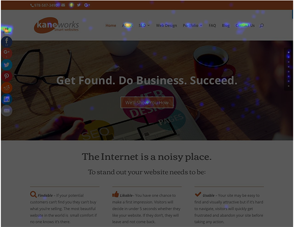
1I have not been compensated in any way by Crazy Egg for endorsing their product. I just like it.
by Marvin Kane | Jul 13, 2014 | Business, Design, Sales and Marketing, SEO
What’s The Goal of Your Website?
This is the first question I ask my clients. It surprises me how difficult it seems to be to get an answer. It’s pretty hard to build a website if the goal of the site isn’t clear. But one thing I hear all the time is something like this:
“I’d like a rotating slideshow on the homepage.”
As a designer I have to admit that these slide shows are visually appealing. But even though they are enormously popular, I advise my clients against using them. Why? Because unless your website is strictly informational, chances are you’re using it to sell something – a product, a service or an idea. That rotating homepage slideshow that is currently in vogue may actually be making it harder for potential customers and clients to buy what you’re selling.
It’s About Conversion, Not Page Rank
Your analytics reports are telling you that lots of people are visiting your site. Good. When you do a Google search for your business, you’re at the top of the SERP (Search Engine Results Page). Good. You’re not gaining any new customers. Bad! So what’s going on here? If you’re focusing on attaining the number one spot on a Google search then you’re focusing on the wrong thing. Wouldn’t you rather have a hundred new visitors to your site who all end up buying from you than one thousand new visitors who do nothing? Pretty obvious right? The objective is to convert your visitors to customers. It’s time to face the ugly truth. The lovely rotating slideshow that is occupying your homepage’s most coveted real estate is turning potential buyers away.
Engage, Don’t Distract
In his regular column on Design, Usability and Conversion, Tim Ash of Marketing Land sites the following:
The whole idea behind image sliders is that a message or image is displayed for a brief while — maybe a few seconds – and then is replaced by another message. But this type of stopping and starting pattern is the most compelling form of movement, because of our evolutionary need to be aware of hidden dangers lurking nearby.
Simply put, the human brain is hard-wired to notice the onset of motion, which makes rotating banners especially distracting. We literally cannot tune them out.
Ash further states:
So, while the movement of the banner may attract the attention of the subconscious, the conscious brain works hard to ignore it.
It May be Time to Break the Habit
Does it really make sense to put your most important information, your key calls-to-action, your value proposition, the “why” of your business in a format that research tells us is likely to be ignored? I like the homepage slideshow just as much as the next guy. I think they look cool and are a good way to attract attention – for a few seconds. That’s how long it’s going to take for your visitors to realize that just before they’ve absorbed the information embedded in the first image, the next one pops onto the screen. The next step is user frustration followed by a quick exit. So unless the sole purpose of your website is to look cool, I would suggest rethinking that rotating homepage slideshow.
But Having Said That …
I should say that even though I advise my clients against using the ubiquitous homepage slideshow, if they insist I will use it anyway. My job is go give them the information they need to make good choices. It’s still their decision.
Now Back to You
Are you hooked on the homepage slideshow? Does your website use one? If so, can you tell how it is effecting your business goals? Does anything I’ve said here make sense?
by Marvin Kane | Apr 6, 2013 | Business, Design
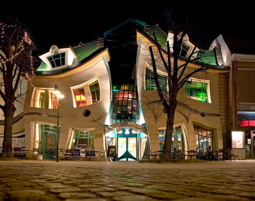
Form Follows Function “The Crooked House” Sopot, Poland
When I pressed a client recently to provide me with the content for her new website, she confessed to having trouble producing it. “Why don’t you show me some designs,” she asked, “and maybe that will help me write the content.” Alarms sounded in my head. Imagine this scenario. You hire an architect to design you a building. In your initial meeting she asks you a simple question: “What will be going inside the building“? You reply, “I don’t know yet but if you show me some designs I’m sure I’ll think of something.” Ridiculous right? It made me think.
Does “Form Follows Function” Apply to Web Design?
In a well researched and highly engaging article by Steven Bradley, Smashing Magazine tackles the question. And as it turns out, the answer isn’t black and white. The term was first coined by American architect Louis Sullivan in an 1896 article. He wrote:
“It is the pervading law of all things organic and inorganic, of all things physical and metaphysical, of all things human and all things superhuman, of all true manifestations of the head, of the heart, of the soul, that the life is recognizable in its expression, that form ever follows function. This is the law.”
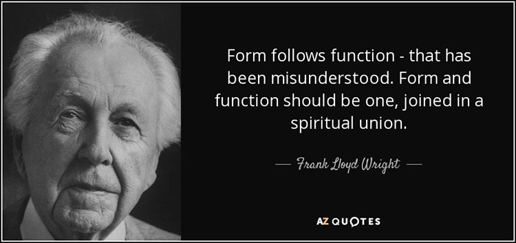
Ironically, it was Sullivan’s most gifted student, Frank Lloyd Wright, who adapted the axiom to changing technologies in the field of architecture:
Bradley’s study reveals many instances in which form does not follow function… in nature for example. Says Bradley, “evolution passes on genetic traits to subsequent generations without any rationale for their purpose. Each generation of a species then finds a use for the form it has inherited. Function follows form in nature“.
Fair enough.
Content First, Design Second
The form follows function axiom is simply too broad and high minded to apply in any meaningful way to the relationship between a website’s design and its content – that is to say content as distinct from functionality. In my practice, content first, design second is a rule of thumb that makes more sense and has more practical applications. Simply put, a website’s content should inform its design, not the other way around. Jeffrey Zeldman, one of the leading minds in web standards in the last twenty five years puts it this way:
Content precedes design. Design in the absence of content is not design, it’s decoration.
What Are You Trying to Say and Who Are You Saying it To?
So what about my client who asked me to show her some designs before she could write the content? My advice to her was this. Think about what you are trying to say and who you are saying it to. Then put it all down on paper without thinking about color, layout, proximity, or any other elements of look and feel. That way you will ensure that your content is not being influenced by design. Then let’s review it together. We’ll talk about ways to ensure that your message is being read – things like bullet lists, text boxes, call-to-action elements, use of color and shape. Yes, it’s possible to start the process with a beautiful design then try to make the content fit. But like the building pictured above, it will eventually cave in on itself.
Now Back to You
When you built your website, assuming you have one, how did the process go? Did you produce the content first or was it the other way around? If you worked with a web design firm, how did they approach the process? I’d love to hear from you.
by Marvin Kane | Apr 9, 2012 | Business, Design
For better or worse, we live an a world of short attention spans. When it comes to websites, particularly homepages, attention spans gets even shorter. Once landing on your homepage a visitor will decide in 5 seconds or less whether he wants to continue to explore your site or leave and go somewhere else. That’s why it’s so important for your homepage to be engaging. Generally speaking a good homepage should be uncluttered and easy on the eyes. Since a picture is worth a thousand words I submit the following three homepages for your consideration:
The Ugly

What makes this site ugly? The site title – Sixties Press – is on a dark graphical background and is difficult to read. The navigation links are all different text colors and are on different colored backgrounds. Why? This homepage makes me want to run away screaming. I was around in the sixties. This site would have been ugly then too.
The Bad

This homepage is a Monty Python parody right? Well, no it isn’t. It’s a for real website. Where do I go? What do I do? How do I find what I’m looking for? Be warned! Staring at this homepage may cause seizures. I don’t know what else to say.
The Good

Disclaimer: I use MailChimp as my Email Newsletter hosting service of choice. I am not, however, on their payroll. I have chosen MailChimp as an example of a good (good is an understatement) homepage because it’s everything a successful homepage should be.
So what makes *MailChimp’s homepage so good? The way it answers the following questions:
Q. What does this company do?
A. Easy Email Newsletters
Q. What can I do here?
A. Sign up for free
Q. What kind of place is this?
A. A fun, friendly place
Put another way, MailChimp’s homepage is clear, focused and easy to digest quickly. Compare it to the first two examples and you’ll see what I mean.
And Now Back to You
When you see a homepage for the first time, what do you look for? What makes you stay and what makes you leave? What are some of your homepage pet peeves? Talk to me.
*MailChimp’s award winning interface was designed by Aarron Walter, the author of Designing for Emotion.
Thank you to webpagesthatsuck.com for showcasing frighteningly bad websites year after year. Take a quick visit. You’ll see what I mean.
by Marvin Kane | Jan 24, 2012 | Business, Design, Rants, Sales and Marketing, Sharing

Think a logo isn't that important? Guess again.
Last week I met with a company on the verge of big things. I can’t talk about what they do because the legalities aren’t in place yet and I don’t want to be sued. The point is they’re on board with the importance of a great website. They just seemed to “get it.” I love working with companies that “get it.” Then they pulled out their business card with the company’s “logo” which they insisted we use. Ouch!
The Logo Police
In my previous life as the Web Production Manager at a promotional services firm, I worked with some big name companies. Each of them had strict brand guidelines – rules for how their logos should and should not be used. I’m talking about things like always maintaining a one inch each area of white space around the logo, never superimposing text or images over the logo, how to properly invert the colors when using the logo on a white or dark background. Why all the fuss? Because these companies (and eventually me too) understood the importance of branding. In fact most of these companies employed entire divisions whose job it was to make sure their logo was being used properly. We affectionately called them the logo police.
It’s About Psychology
Here’s how my handy pocket dictionary defines logo: n. a symbol used by a corporation, business or company as its emblem. Fine. Here is what a logo really is. It’s a visual expression of your company’s identity, core values and beliefs. It’s durable, flexible and transferable. You can put it on a golf ball, a coffee mug, a tee shirt or a hat. You can put it on anything anywhere. It travels well. It builds equity and power over time. The site of it evokes a visceral response. It makes people think about what it’s like to own your product, eat your food or drive your car. Think I’m overstating? Look at the logos in the box at the top of page. See what I mean?
“I don’t love it, but it will grow on me”
Phil Knight, CEO of Nike after his first glimpse of the now famous swoosh
Trust Professionals
Back to my meeting last week. It seems the good folks at the company designed the “logo” themselves because they believed it depicted the essence of their newly patented process – and since they knew that process better than anyone else it followed, according to their logic, that they would be best qualified to design their logo. Logical but wrong.
Quick Summary
- Think about the power and importance of your company’s logo and let an experienced, talented, professional designer design it for you. Hint: think Nike swoosh
- You’ve invested countless hours and had sleepless nights conceiving your business. Don’t get cheap when it comes to the symbol that will be the face of your business. Hint: spend less on that cushy leather chair and more on your logo
- Give it up. I know it’s hard but if you work with the right designer he/she will treat your ideas with respect. Hint: you have kids but they eventually leave
And Now Back to You
Are you happy with your logo? How important do you think it is? Am I making too big a deal out of it? Talk to me.
by Marvin Kane | Nov 30, 2011 | Design, Technical

Designing for Mobile is About Easy Access
According to Mary Meeker, Internet analyst and Managing Director at Morgan Stanley, within the next five years “more users will connect to the Internet over mobile devices than desktop PCs.” For business owners looking to launch a new website, it is essential to consider how the site will render on mobile devices. For web designers, the rules have changed … again.
Responsive Design
Thanks to the work of cutting edge web designer Ethan Marcotte, we now have the tools and techniques to effectively design websites for mobile devices. And by effectively I mean not simply displaying a miniature version of the site that you see on a desktop computer. Responsive Design, the term coined by Marcotte, actually detects what type of mobile device is being used and then displays the site optimized for that specific device. Pretty neat!
Like The Old Days Only Different
In the early days of the web, there was no standardization. Websites rendered differently depending on the browser being used. Designers, a temperamental lot to begin with, had nightmares over not being able to control every aspect of the user experience. That was then. This is now.
It’s About Usability
With all the variables in play like screen resolution, browser vendor and version, installed system fonts, monitor size, color variation and user preference, web designers finally get it. (At least the good ones do). It is not absolutely necessary that websites look exactly the same across all devices. (I know. This is a tough one for designers to swallow). It’s about usability – making sure users can quickly and easily find the information they are looking for … which brings us back to designing for mobile devices.
A well designed mobile site:
- is not just a miniature version of a desktop site
it accounts for the fact that mobile users are close to taking some action and clearly presents the information needed to simplify that action
- is not accessed by a separate url or web address
a user going to the site on an iPhone and a user going to the site on a desktop computer both use the same url.
- will adjust the layout of the site responsively
When properly coded, the design will “know” what type of device is being used and will respond by displaying the site optimized for that device.
And Now Back To You
Business owners, was your site designed for mobile? What do you see when you view it on an iPhone, Blackberry or Droid? Is it what you thought it would be? If you are still in the planning stages, is mobile part of your thought process? Thanks for your comments on this one.
Photo credit: Yodel Anectodal