
 The 1970’s Polyester Leisure Suit
Just like clothes, hairstyles and cars, web design trends go in and out of style. If you saw someone wearing a 1970’s vintage polyester leisure suit you would make a judgement wouldn’t you? If your homepage is the online version of that suit, be assured that visitors are wondering if you’re out of touch or you just don’t care.
 Thin Content
There’s just not enough useful information on your homepage. You might have lovely images, bells and whistles or any number of visual distractions. How does that help your visitors understand what you do, how you do it and why you’re different than your competitors?
 Contact Information Not Prominent
Isn’t The goal to get visitors to call or email you? It should be. Make sure your contact information isn’t buried somewhere or worse, not even present on your homepage. Don’t shoot yourself in the foot by giving your visitors what they want then making them hunt for your phone number.
 The Lovely but Useless Image Slider
You’ve seen them. They’re everywhere – those full width sliders that entertain your visitors by displaying rotating images with bits of copy superimposed on them. Yes, they are engaging but beyond being fun to watch what value are they really providing? Unless you’re a photographer or an artist where the image is the message, you’re not doing your visitors any favors by hogging the most valuable piece of real estate on your homepage with that image slider. There are other ways to make your homepage visually appealing without wasting prime space that should be used to tell your visitors who you are, what you do, why you’re different/better than your competition – you’re USP (unique selling proposition) – where you do what you do, what areas you serve and how to get in touch with you.
 The Disappearing Call-to-Action
We know about the call-to-action elements – you know those cool buttons that ask your visitor to click to download a pdf or sign up for your newsletter or make an appointment. Well it matters where those call-to-action elements are on your homepage. Make sure they are at least above the fold. If the page has lots of content, then put another one in the middle of the page. If the page is really long then put another one at the bottom. The point is that no matter where your visitors are on your homepage a call-to-action element should be visible.
 Where’s the NAP?
NAP is an industry acronym that stands for Name, Address and Phone number. The NAP should be on every page but especially the homepage since that’s the page your Google Business profile links to. You can put this info in the footer, but I always like to include the phone number somewhere in the header as well. That way, when your site is being viewed on a mobile device, the phone number is right there at the top where a user can simply click on it to call you.
Useful Tools
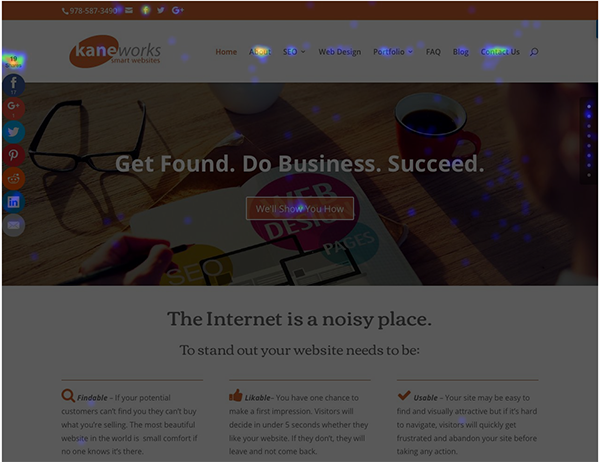
There are tools available that show you where your visitors are clicking and what links they are ignoring. Use the tools to learn about what area of the homepage is attracting the most attention and make changes accordingly. I use Crazy Egg1 for this but there are other tools that do the same thing. The screenshot below is a heatmap showing where users are clicking on my homepage.
1I have not been compensated in any way by Crazy Egg for endorsing their product. I just like it.